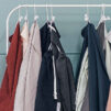

A unified color scheme is a key to making sure all your clothes match perfectly. It’s the foundation of a rational closet idea. Today we’re going to talk in detail about the main color strategies for forming closet capsules.
Full-Color Wardrobe Strategy
For a full-color closet strategy, to maximize the combinatorial nature of your closet, you need items in the same color palette or with the same saturation of color tone. In this case, you can safely add achromatic colors (black, white, gray), neutrals (all shades of beige), and conditional achromatic colors to your closet. The latter can include both maximum light and maximum darkened colors, as well as classic denim colors.
Warm Shades
These are essentially closet capsules assembled from things with warm color undertones. In such a multicolored closet, all items are guaranteed to match each other.
What is a warm undertone? If you add a drop of yellow to any color, this slight addition will make it look warmer. With a certain amount of experience and color insight, the human eye can recognize the warm undertones of any color tone. It is better to exclude black from the closet formed in warm tones, replacing it with bitter chocolate or dark blue colors because black is the brightest possible cold color, in which a slight yellow addition is not legible at all.

Cold Shades
Here, your closet will be formed only in a color scheme with cold undertones. A cold shade of any color is achieved by adding a drop of blue paint to it. In such a closet, you can safely add any achromatic colors: black, gray, white. It is better to choose neutral beige or beige with gray, cool pink, or purple undertones from the spectrum of beige colors. And also, remember that orange in any shade cannot be in such a closet. Orange in no shade at all can be a cool shade.
Light Shades
When all the items in your closet are in light colors, they will also match each other perfectly. Why? Because light shades are obtained by adding white paint to any chromatic color. Such light shades of color are detected by the human eye without much effort. Therefore, anyone can implement this color strategy to make a perfect match of colors in their closet if they wish.
You can ignore the temperature undertones of the items in your closet because having a lot of white in any color makes it more neutral in terms of temperature. Often even the trained eye cannot always detect the temperature overtones of light bleached colors. Suppose there is so much white in an achromatic color that the hue is barely discernible. In this case, we are dealing with a conventional achromatic color that has almost as much versatility as white.
When forming a closet in a light color scheme, we can safely include items in achromatic white or light gray colors, but be careful with black, especially in large proportions; it is better to replace it with dark blue, brown, or graphite shades.
Dark Shades
In the case of dark shades, your entire closet will consist of items in deep dark shades and rich gem colors. Dark saturated shades go very well together, regardless of the undertones’ temperature, which will not be too noticeable because of the substantial addition of cool black paint.
Black, dark shades of gray, dark blue denim, as well as white in small proportions will look perfect in such a closet.
Muted Shades
The muted unsaturated shades are obtained by adding gray paint to the pure chromatic color. It gives the color a “dusty” effect. Usually, the human eye easily recognizes the addition of gray dye without long color observation.
Such shades are pretty versatile in terms of appearance and lifestyle coloring. The muted colors in the closet can be lighter or darker, but the gray undertones should be legible quite clearly. It is best to exclude bright black and snow-white color from such a closet, replacing them with graphite and muted white colors.
Bright and Ultra-Bright Shades
Theoretically, such a closet scheme has the right to exist. But from a practical point of view, it is not very sustainable.
Combining a large number of bright, clean saturated colors in the image will not suit everyone. And of course, not many lifestyles and image requests can be suitable for such color schemes. The quintessential bright saturated colors are the classic acids or neons, suitable for adding accents in the outfit but not appropriate for making up 90% of your basic closet. A bright saturated color strategy would definitely be appropriate for a sports capsule. But even sports outfits in such bright shades are nice to dilute with achromatic colors – white, gray, black.
In terms of color semantics, all bright saturated colors are about dynamics, an active lifestyle, joy, youth, and maximalism.